
West Fest is a IFC-run philanthropy event at the University of Texas at Austin where fraternities and sororities host a variety of social events and musical performances throughout one weekend. I designed the visual identity and various assets for my fraternity's West Fest events, which were centered around two musical performances from the artists DaBaby and Wasted Tuition. Around 2,000 students attended our events.
The project was centered around typography and began with an exploration of how the branding should feel. I explored multiple Texan motifs--wood serif type, longhorns (both the actual horns of the animal and the animal itself), and different color schemes. I played around with different typefaces and text lock-ups to see how I could cultivate a brand image through creative typography.
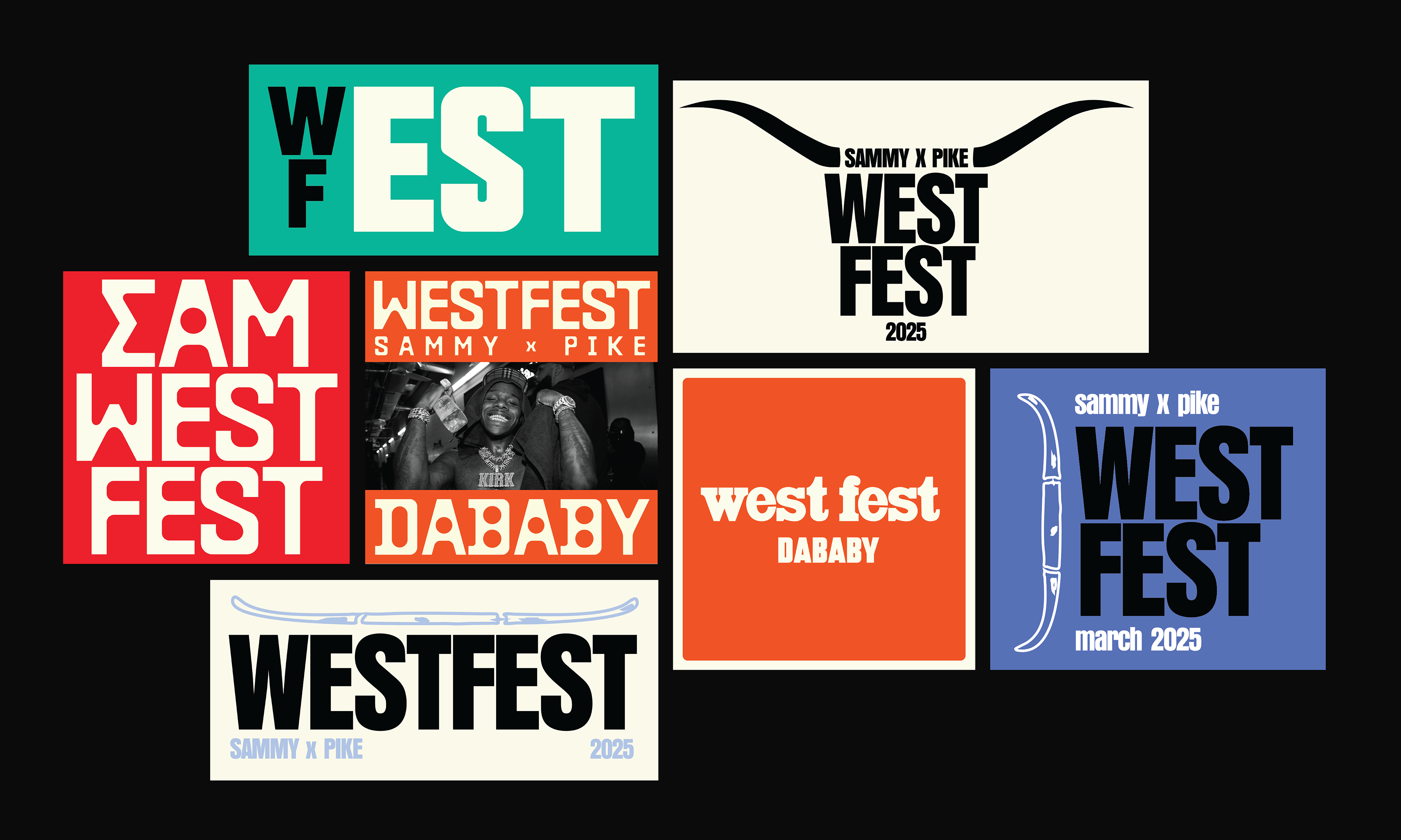
early graphic explorations
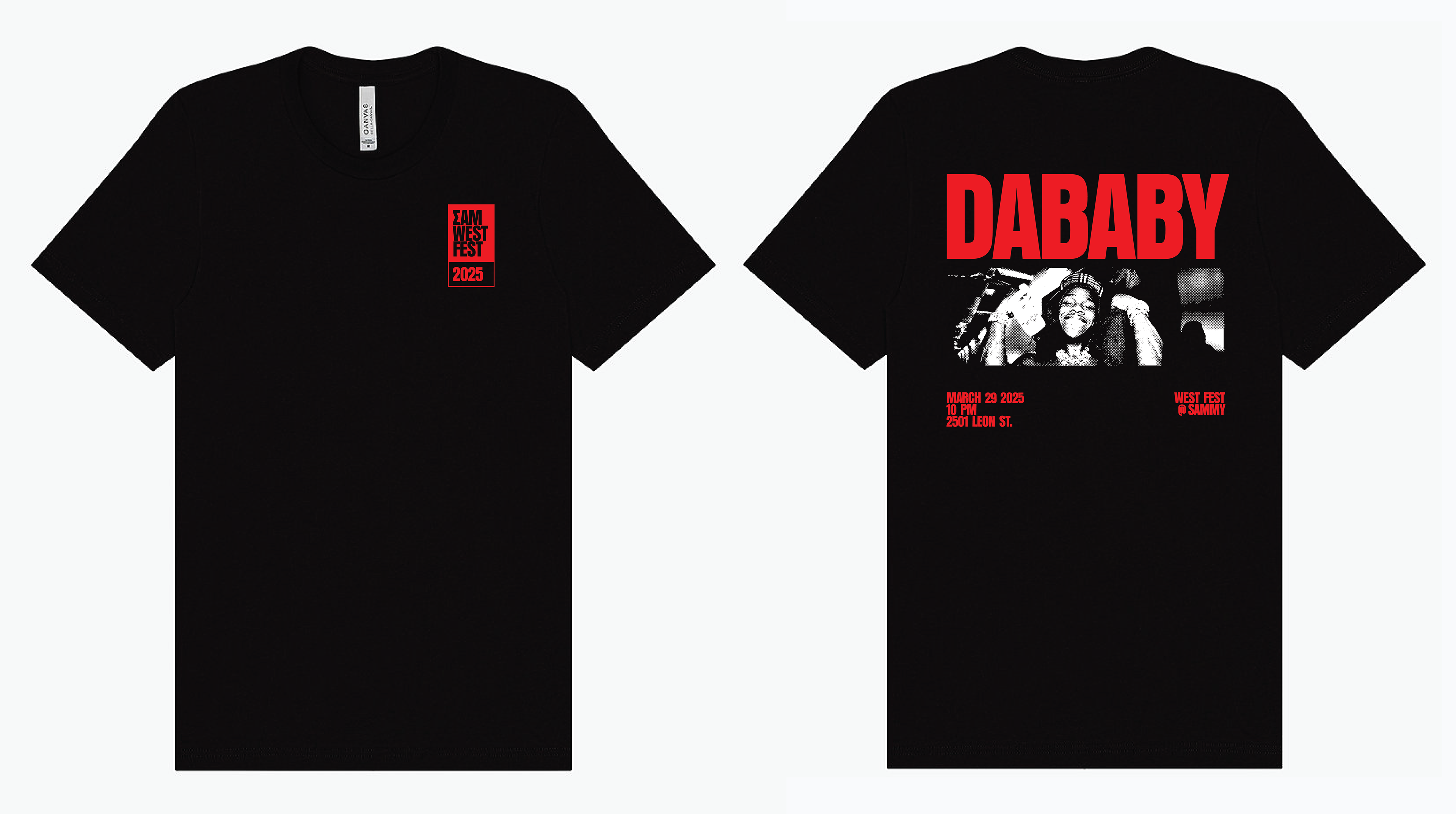
After working through various ideas, I arrived at a clean, vertically emphasized, and bold font called Anzeigen Grotesk that lended itself well to the modern musical genres (rap and house music) of the performing artists. The visual identity revolved around a bright red associated with DaBaby's branding. This branding was applied to posters, fabric festival bands, credentials for event staff, and shirts to commemorate the event.
The posters were posted on Instagram in a carousel post and use a progressive saturation of red color from the first poster to the second to build a sense of anticipation and excitement for DaBaby's performance as a user swipes from the first photo to the second. To further emphasize this sense of excitement, I made the title text 'DABABY' cropped by the poster's sides and crammed against a large landscape photo of DaBaby, creating a sense of compression and force. The thin tracking lines between each body of text smooth the transition between the first and second photo.
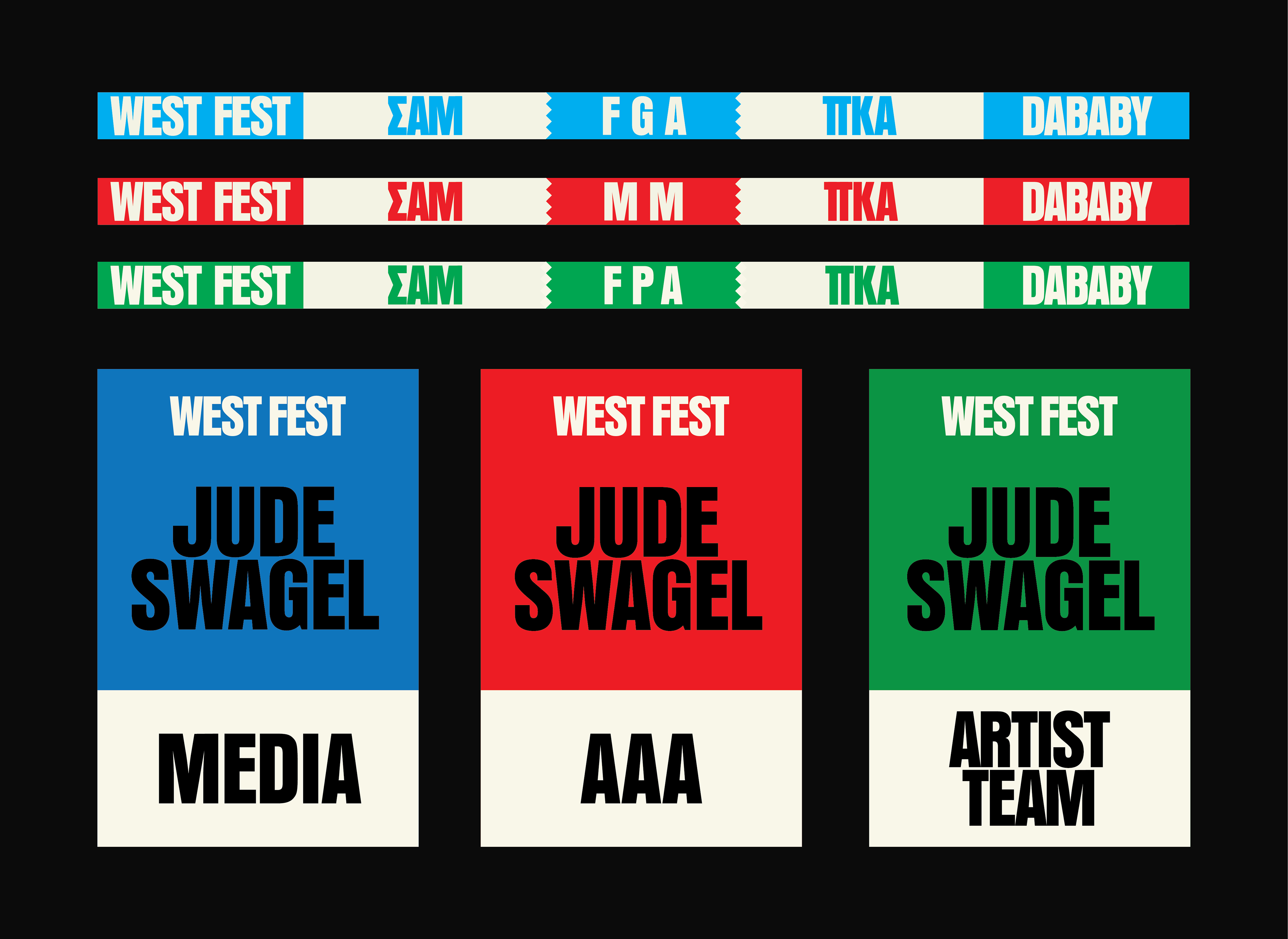
The festival bands and credentials utilize bright colors to be easily interpreted and understood. I wanted the shirt to feel like true festival merch and created a sharp front design revolving around a wordmark and a back design inspired by grungy 1990s telephone pole concert posters. Letters composing the text on the back are slightly skewed and shifted to emulate a handmade and 'printerly' effect. The color palette of the shirt design was limited to create visual contrast and stay cost-effective for printing.